Learning
Training in web development. Motion, interaction, and the crossover with design.


insper-U is a community started by young people. It shares positive messages, ideas, and stories on social media. The goal is to help other young people get through hard moments.
A lot of young people deal with stress, low self-esteem, and overthinking. The pressure comes from school, family, social media, and comparing themselves to others. Some people handle it. Some don't have the tools or the support yet. insper-U gives them small, regular reminders that there is a way through.
The two ideas the identity is built on, and the one rule that runs through every piece.

The identity uses only black and white, taken from the Yin and Yang idea. Black is the hard times. White is hope. Two colours, one meaning, nothing to decode.
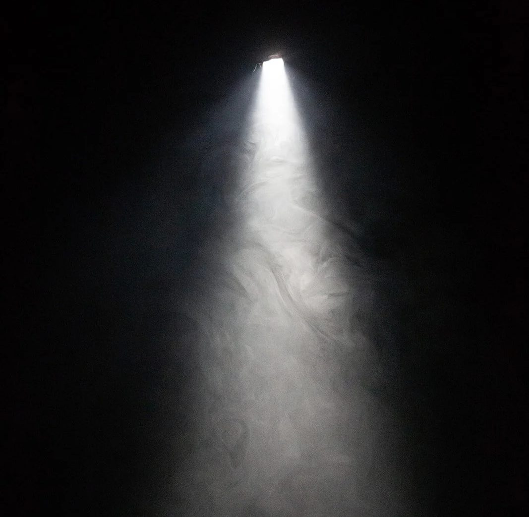
Every piece starts on a black background. White text and shapes sit on top of it, like light breaking through. That one rule runs through the logo, the posters, and everything else.
The wordmark is set in Josefin Sans. Lowercase, with a capital U at the end — insper-U reads as "inspire you." For small spaces like profile pictures, there's a short i-U mark in a circle.

Josefin Sans by Santiago Orozco is the only typeface. Its geometric, slightly vintage letterforms feel friendly rather than corporate, and they stay clear set large in white on black. One family across the wordmark, posters, and social keeps every piece speaking in the same voice.
Bold, SemiBold, Regular
Josefin Sans SemiBold
Josefin Sans Bold
Josefin Sans Regular
Josefin Sans Regular
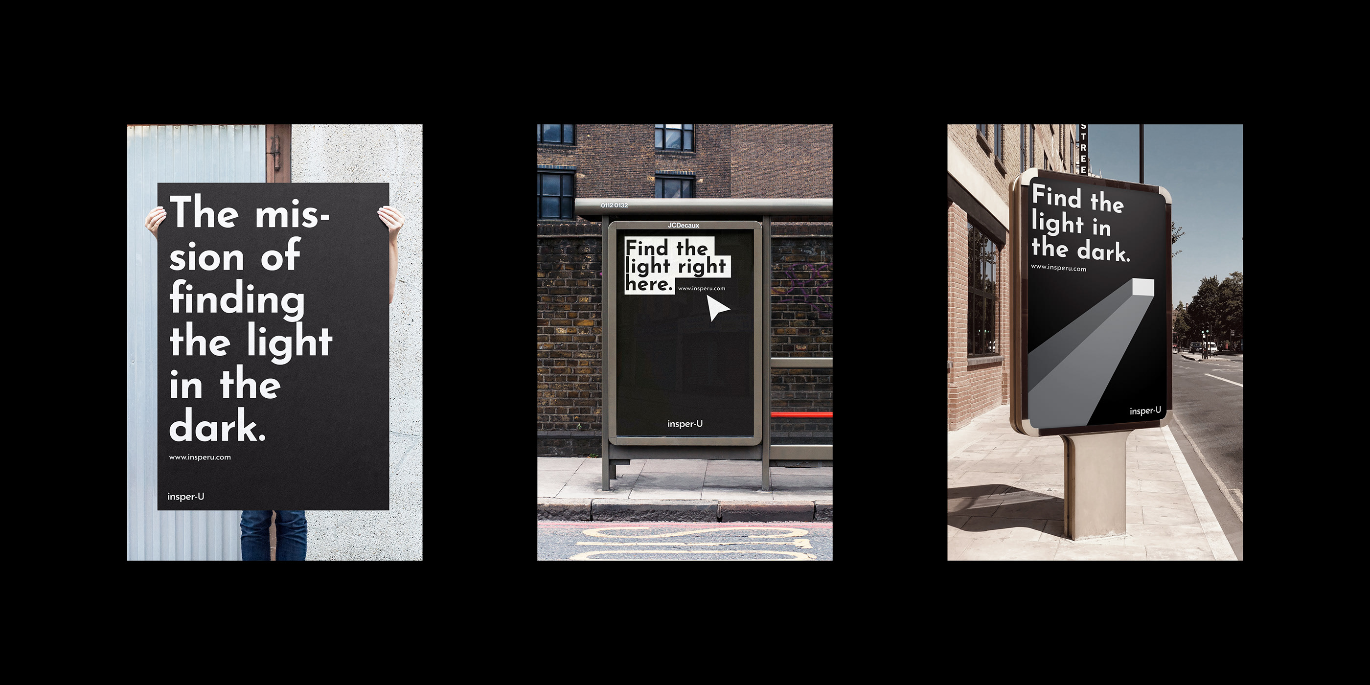
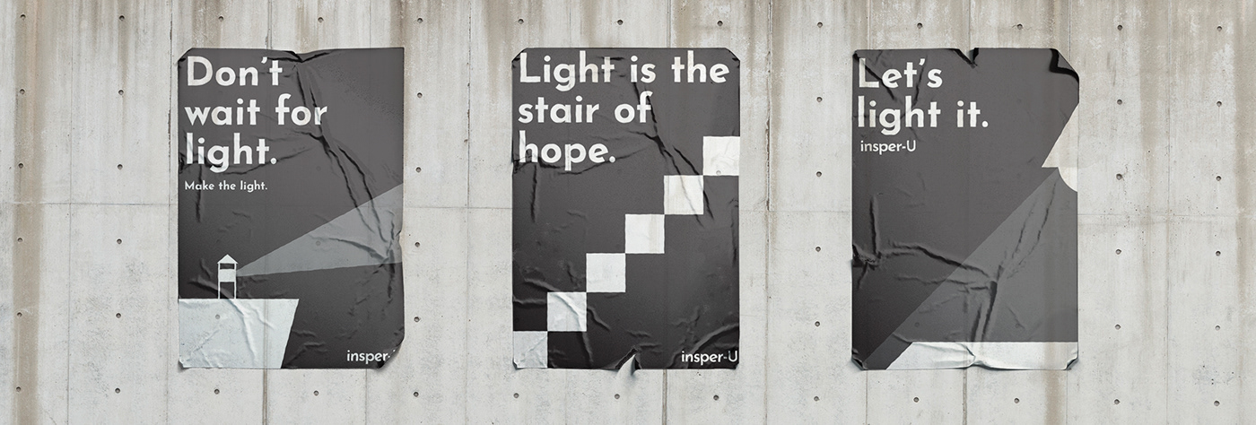
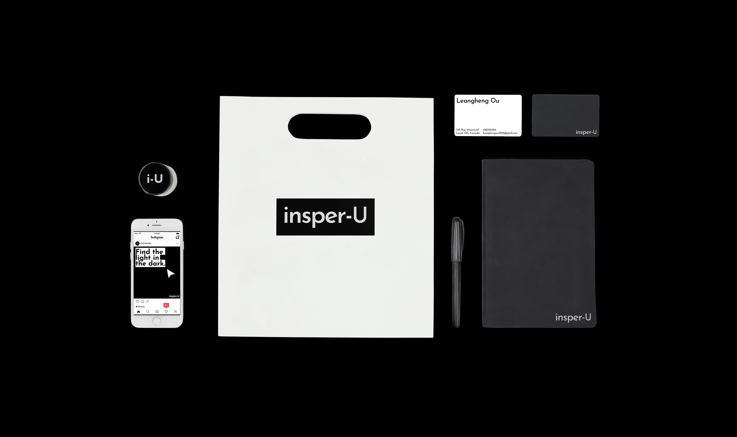
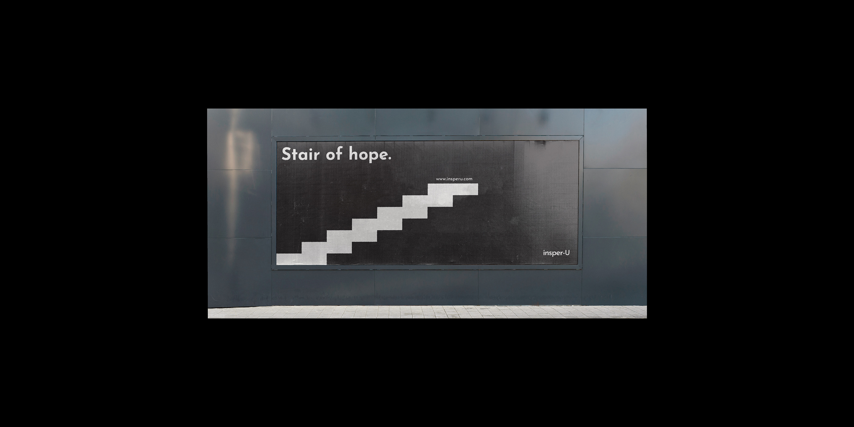
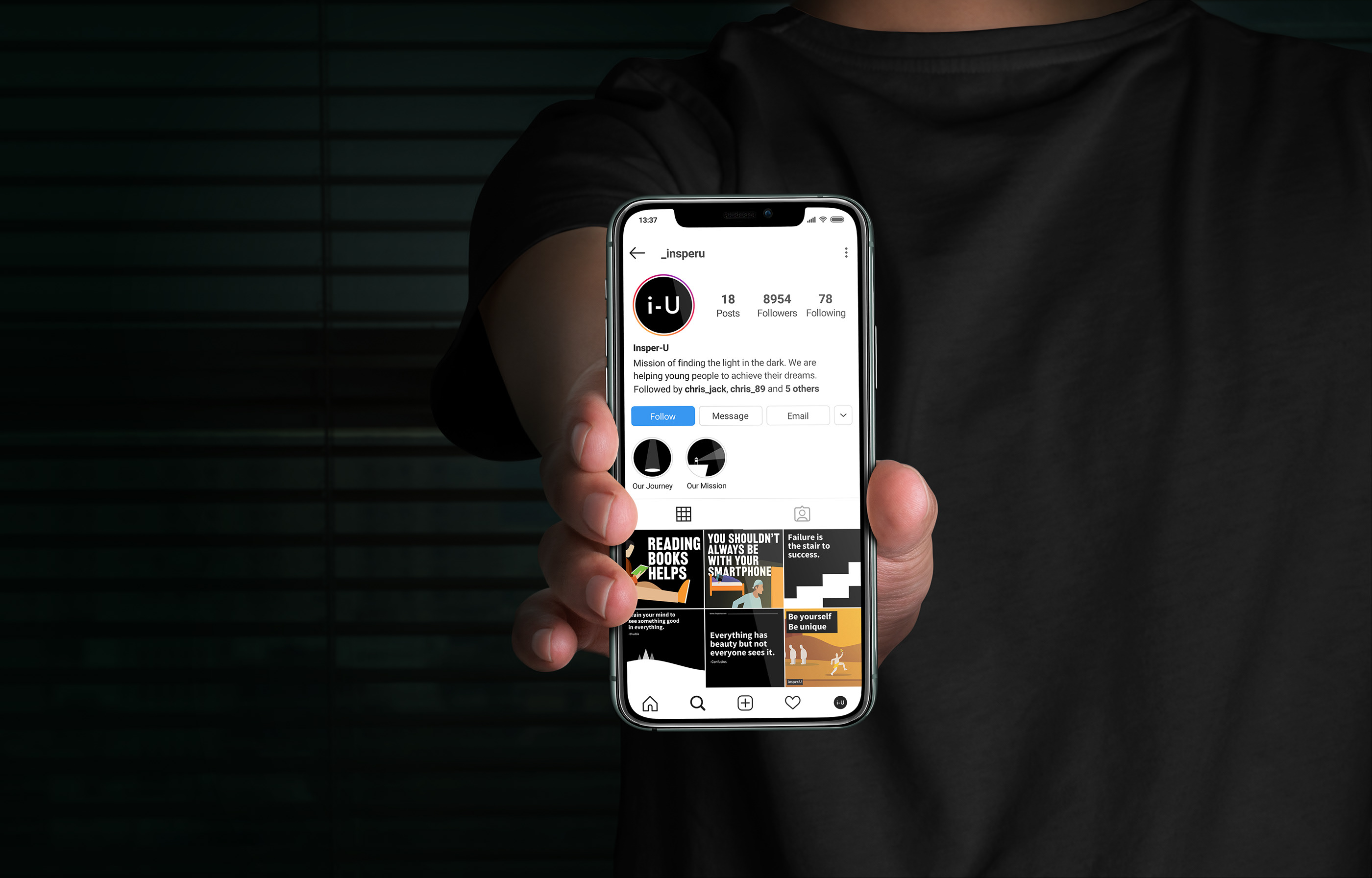
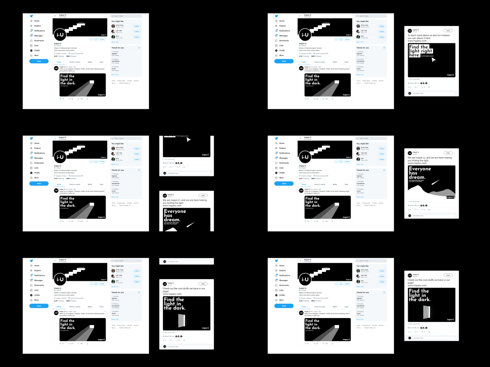
The community lives on Instagram and Twitter, so the brand had to work at the size of a thumbnail. The i-U mark holds up as an avatar, and the black posts stand out in a busy feed.
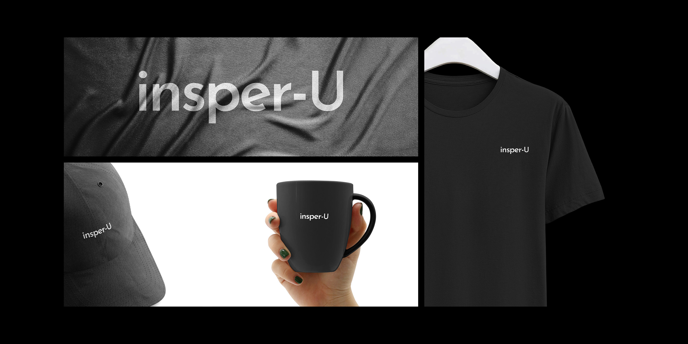
Tees, caps, mugs, bags, business cards, and notebooks. Same rule everywhere: black base, white type. Nothing extra.
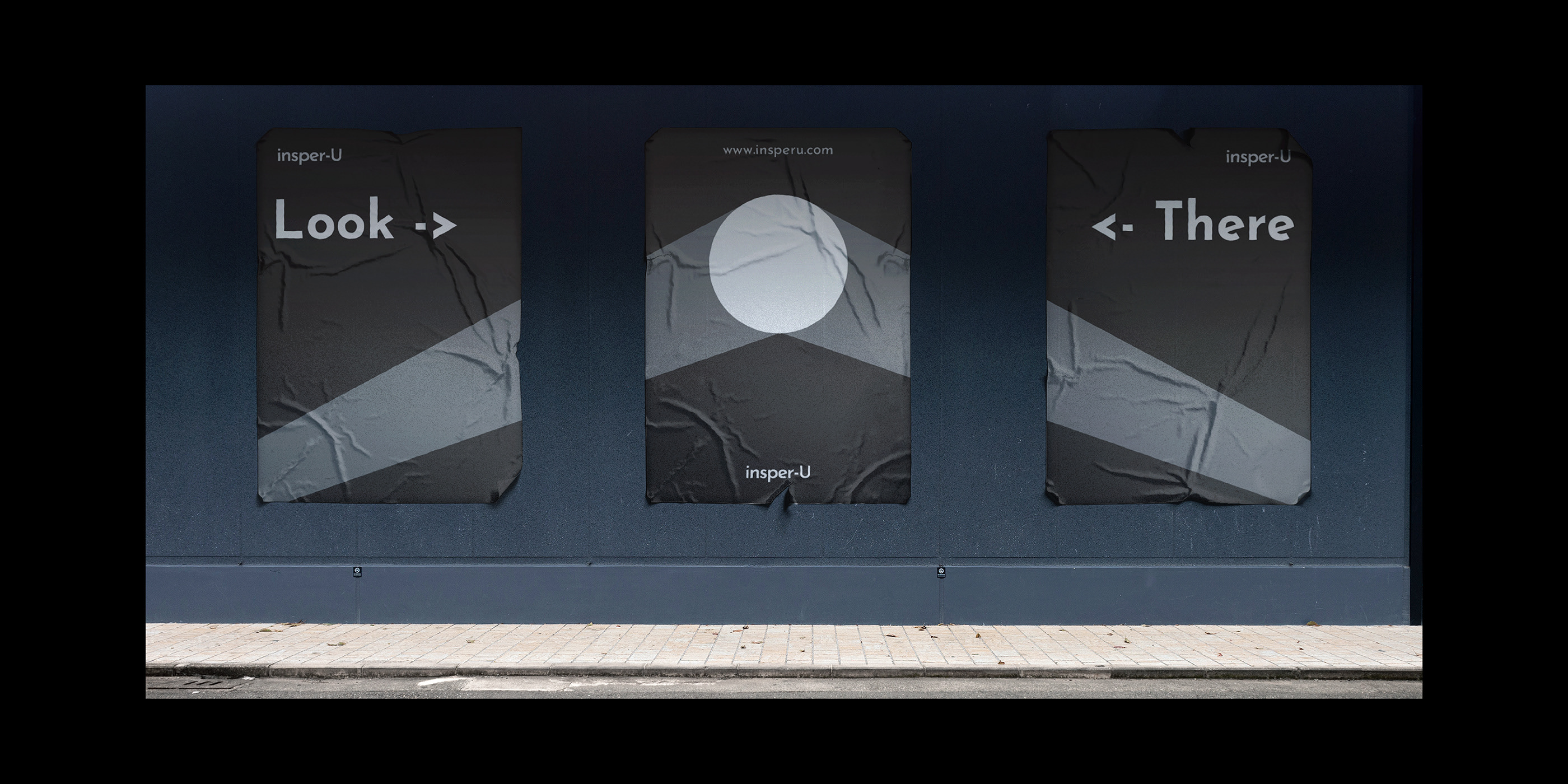
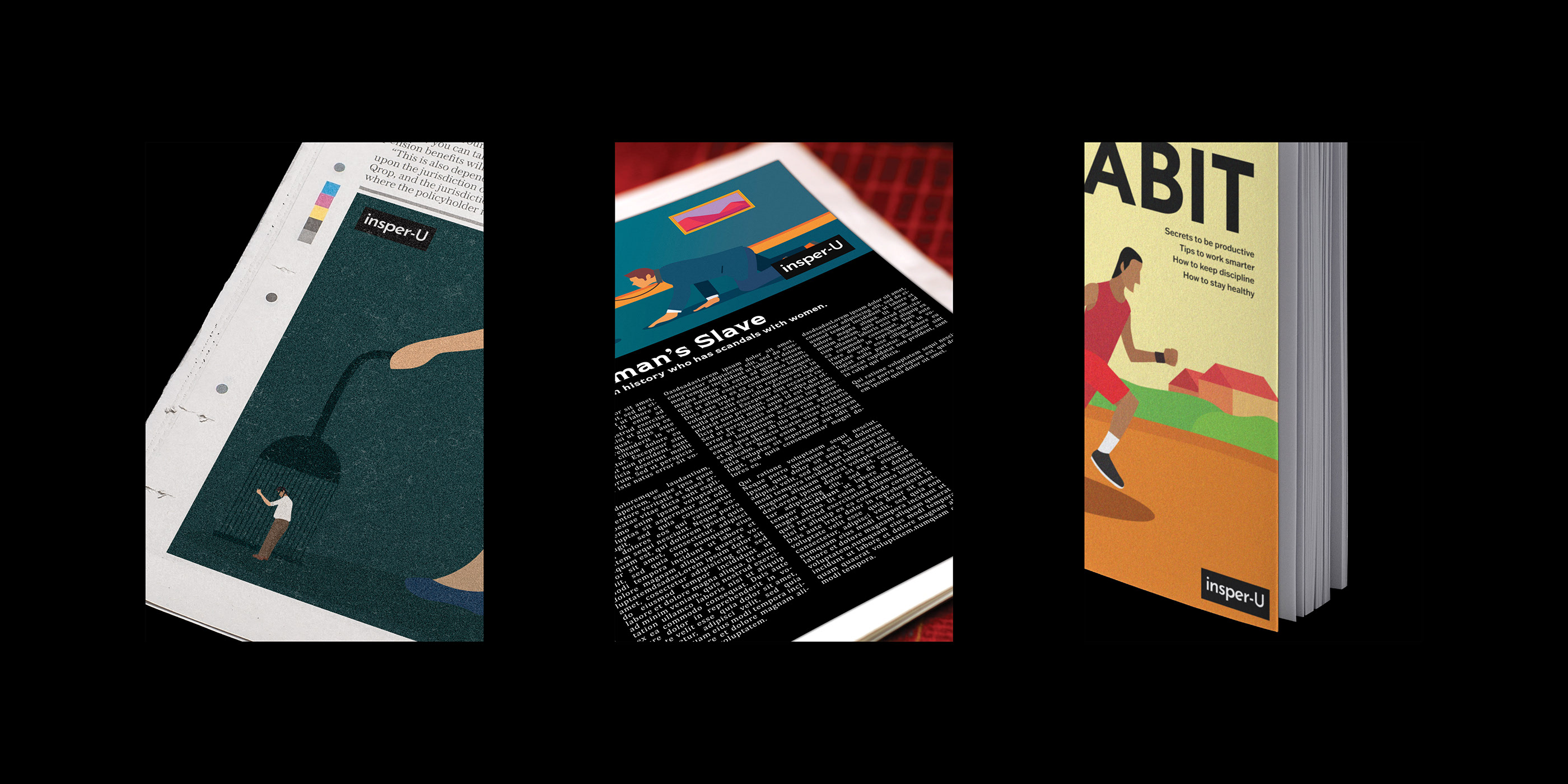
{ More work }
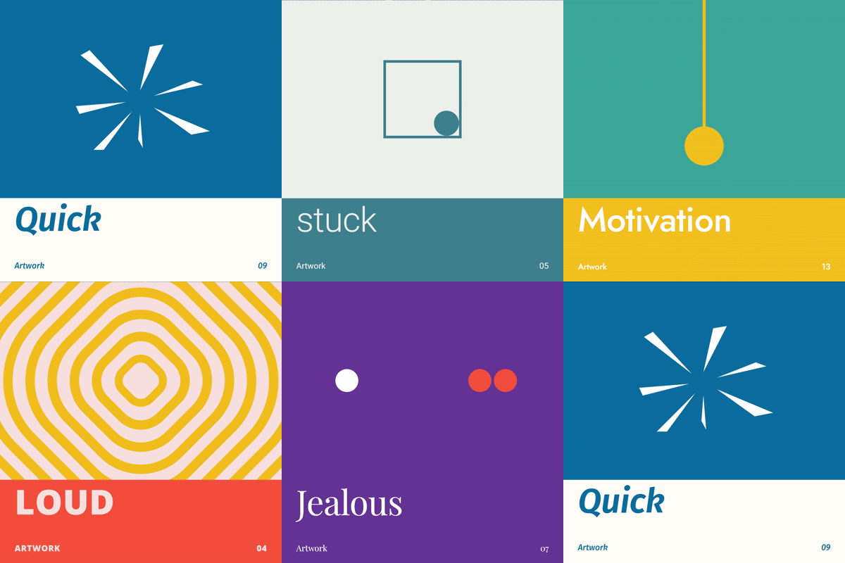
Fifteen moods reduced to flat shapes, a colour pair, and one word.
View project
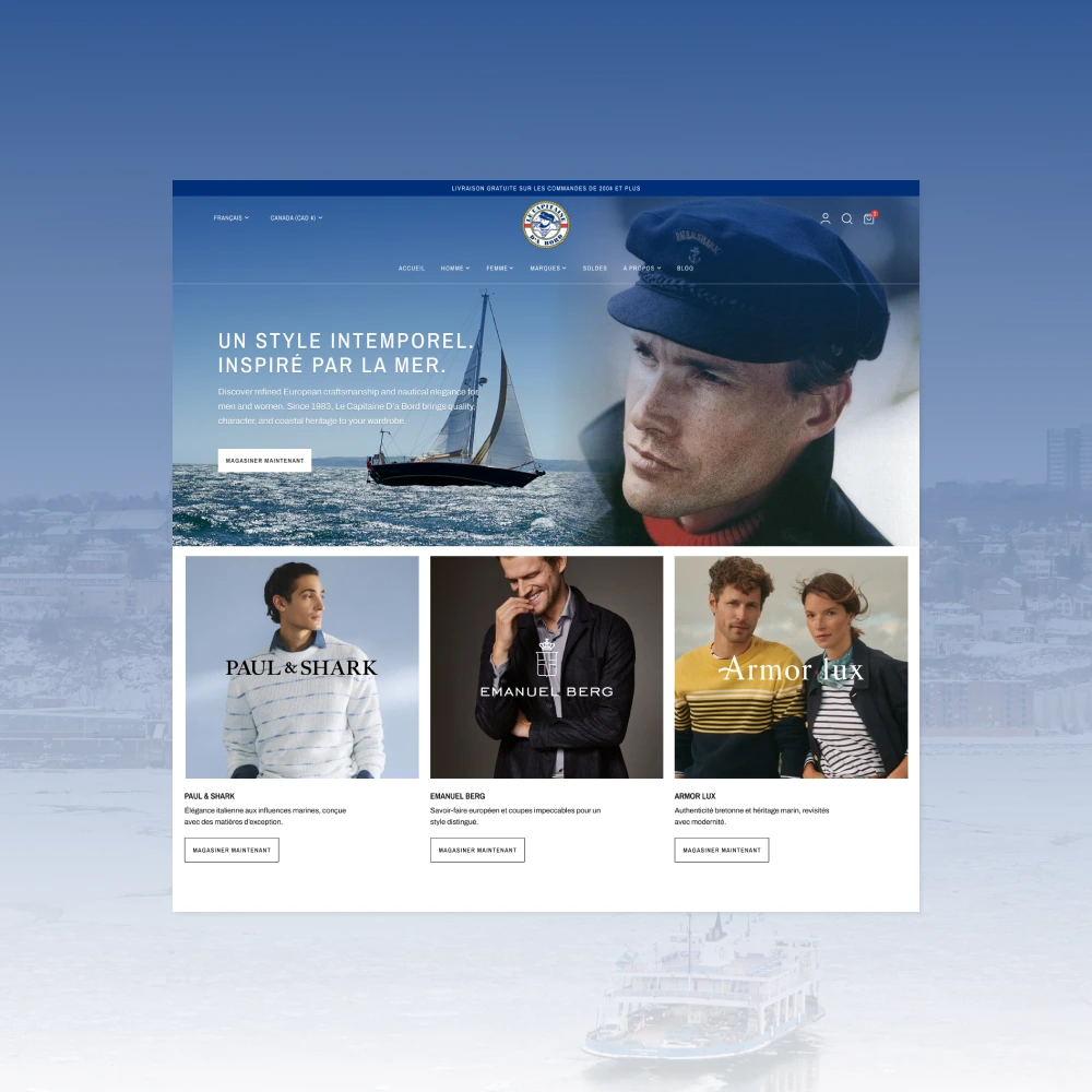
A modern, masculine Shopify refresh for a heritage nautical boutique in Old Québec.
View project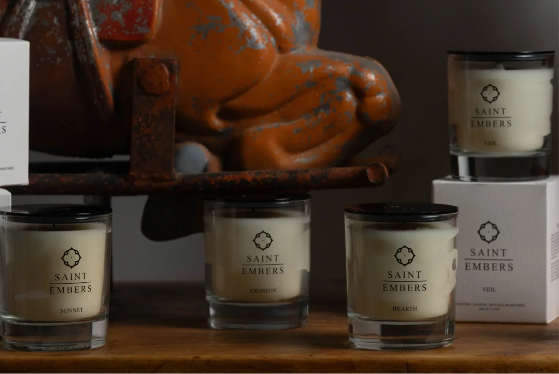
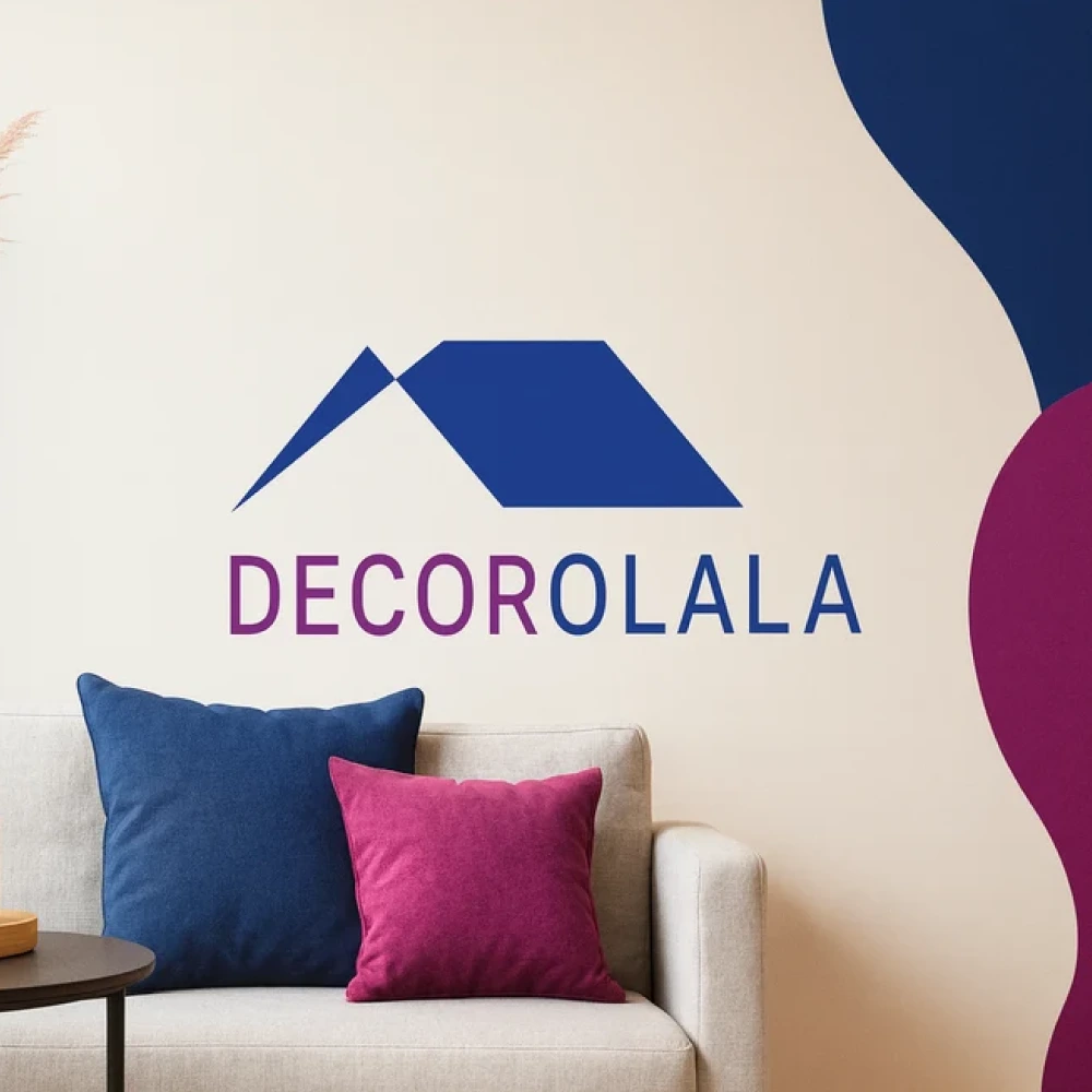
Custom Shopify loyalty program, dynamic cart-drawer rewards.
View project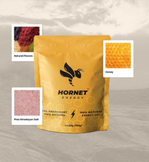
Designing and building an early e-commerce experience for a growing energy-gel brand.
View project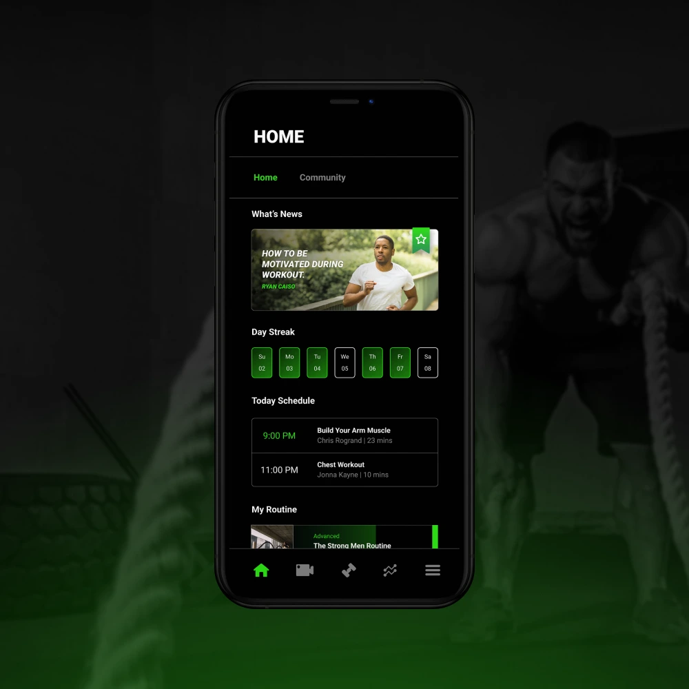
A UX case study for a fitness app, from user research to an interactive prototype.
View project